Role: UI/UX Designer
Tool: Figma, WordPress, Gmeet, SORA
1. Project Overview
Call My Dokter Mobile App Redesign
A self-initiated UI/UX redesign of Call My Dokter’s mobile application, focusing on modernizing the interface, improving user flow, and introducing an innovative AI-powered Health Assistant feature.
2. Background & Problem
After being commissioned to redesign the Call My Dokter website, I learned during a client meeting that a mobile app redesign was also planned. However, there was no formal request for a mobile app revamp at that time.
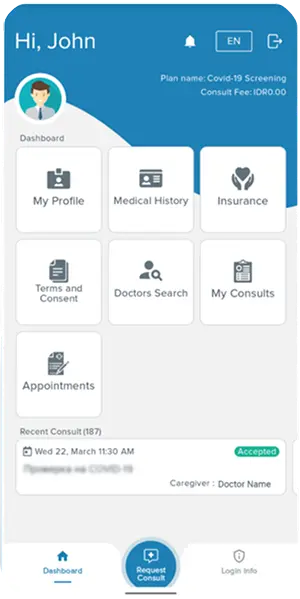
So I took the initiative to redesign the app. The main challenge was that the Call My Dokter app is private-accessible only to registered users, with no open sign-up, despite being listed on Google Play. I had never used the actual app. My only reference was seven screenshots available on Google Play. This limitation meant I had to make several assumptions, carefully supplementing gaps using industry research and best practices.
3. Goals & Objectives
- Modernize the UI and UX to align with current digital health app standards.
- Streamline the user journey to make healthcare access intuitive and efficient.
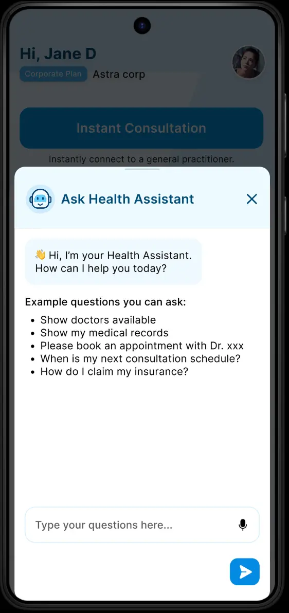
- Integrate a Health Assistant an AI-powered feature that enhances user engagement and offers smart health support.
- Maintain brand consistency with the recently redesigned website.
4. Research & Discovery
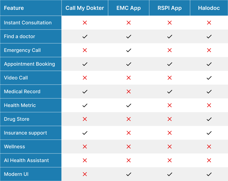
With limited information from the screenshots, I conducted competitive benchmarking against leading healthcare apps such as RSPI, EMC, and Halodoc.
I mapped out typical flows, features, and pain points from these apps, then applied these insights to reinterpret and improve Call My Dokter’s experience.
I also researched technical feasibility for integrating an AI Health Assistant using third-party solutions like ChatGPT, ensuring that my proposed features were realistic and achievable.
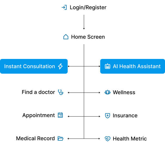
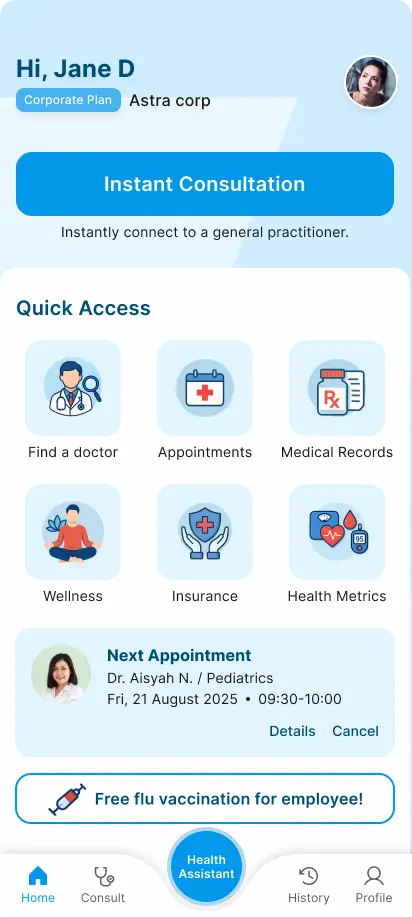
5. User Flow & Information Architecture
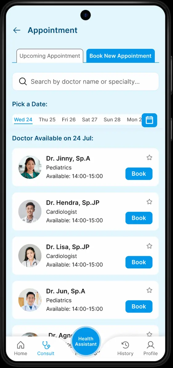
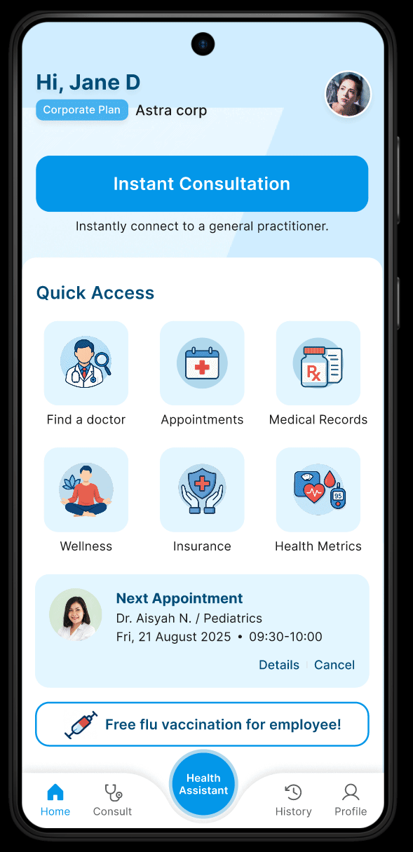
Due to the absence of actual user data, I designed the flows based on the “best of” user journeys from the apps I benchmarked. My focus was on minimizing steps to core actions (e.g., search a doctor, booking consultations, viewing medical records) and providing prominent quick-access options.
I introduced a dedicated AI Health Assistant section, ensuring it was easily reachable, while keeping the main navigation clean and familiar for users.
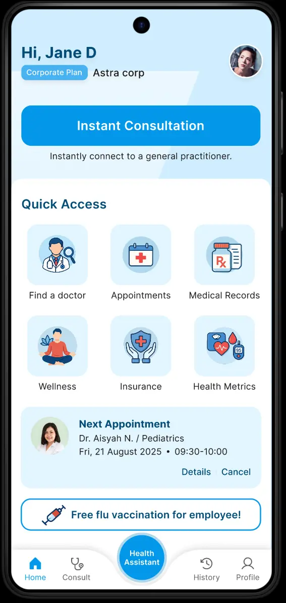
6. Ideation & Rapid High Fidelity Design
Instead of traditional wireframes, I moved directly to high-fidelity mockups to quickly showcase the new UI direction. This approach was chosen to make the redesign’s look and feel immediately tangible for client feedback, leveraging strong visual references from leading health apps.
7. Visual Design
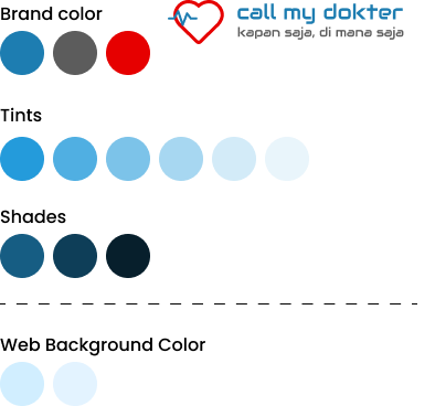
For visual consistency, I retained the blue and white color palette from the website redesign, reinforcing brand identity.
All icons were generated using SORA AI, though the process involved significant iteration and trial and error to achieve clarity and style alignment, as AI-generated icons often required refinement.
8. Prototype & Interaction
I built an interactive prototype to showcase key flows: onboarding, quick access actions, Health Assistant interaction, and appointment management.
Special attention was given to microinteractions and feedback states, ensuring that the app felt responsive and supportive-especially in healthcare contexts where clarity and trust are paramount.
9. Design Rationable
Every design decision was guided by:
- Empathy for end users-many may be accessing care under stress or urgency.
- Best practices from top health apps-prioritizing accessibility, clarity, and ease of navigation.
- Scalability-ensuring new features (like the AI assistant) could grow in capability without disrupting existing flows.
- Brand alignment-maintaining a seamless experience across web and mobile.
10. Before & After Comparison
Before: Outdated, crowded, unclear navigation.
After: Modern, clean, intuitive, AI-powered.
11. Outcome & Impact
Upon presenting the redesign and the Health Assistant concept to the client, the response was highly positive.
The client expressed enthusiasm for the new direction and features, leading to further discussions about developing a comprehensive user flow and preparing UI assets for implementation.
12. Status & Next Steps
- Initiative can unlock new opportunities-proactively tackling the mobile app (even without a brief) positioned me as a strategic partner, not just a vendor.
- Working with limited references is possible through research, empathy, and benchmarking.
- AI in healthcare UX holds real potential but requires careful planning and validation.
- Consistency across platforms is key for building brand trust in digital health products.
11. Disclaimer
This case study is a self-initiated redesign based on publicly available screenshots and assumptions from similar health applications. The final implementation may differ based on client decisions, technical constraints, and further user research.